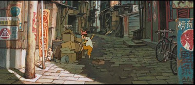
As can be seen from the positive (left) and negative (right) version, this image is based on the complementary colors orange and blue.
In my last post I was mainly interested in the use of another pair of complementary colors: red and green.
To round this out, here are some more screengrabs, non-chronologically arranged according to visual aspects.
Two-color schemes
Many shots seem to be limited to two colors only. Sometimes this is achieved by having only objects of the same two hues in a shot (below right), sometimes lighting does the job. We're most familiar with color changes caused by lighting at night, or more generally speaking, when sunlight is absent (below left).
In most images these two approaches work together in some way, though.
So for example to give the impression of a colorful but ultimately brown city, whole sets that are dominated by shades of red and green do the trick:
There are rooms and daytimes where red is clearly dominant:
object colors (skin tones natural)
vs lighting
the spots of blood and the door stand out in an otherwise monochrome composition. All object colors again...
...whereas these greenish shadow areas are designating the absence of sunlight.
Red-green props
In addition to many props like bottles, chairs, stools and frogs, many logos and written ads are red, white and green as well.
The whole city seems to be tiled or at least regularly fragmented:
Note how the stone colored tiles always lean towards red or green, depending on lighting, mood, or plane separation.
Colors are also structuring the city overall: recurring object colors subconsciously help us recognize certain large objects.
In this long shot we see that bridges on land are cyan while bridges crossing the river are red.
water is always greenish never pure blue, ships and bridges red.
the two opposing observance objects (the bad guy's ball and the kids' tower) are in opposite colors. The thing I like about this ball is that it doesn't look like it was painted green, it just looks like grey metal with stains of brown/red rust whereas the tower is clearly painted red and white.


No comments:
Post a Comment